UX/UI Crash Course- YouTube
- Sasha Blore

- Jun 29, 2024
- 3 min read
Intro
Hey! so before I move on to day 2 of my 100 days of UI, I want to do a quick crash course from YouTube. Why? Because out of intrigue, I watched some of it last night and it really helped me to understand some of those gaps in my knowledge. It explains components and how to make variations, which was something I was struggling with and it will improve my efficiency by miles!
So let's hop on in!
Setting Up the Project
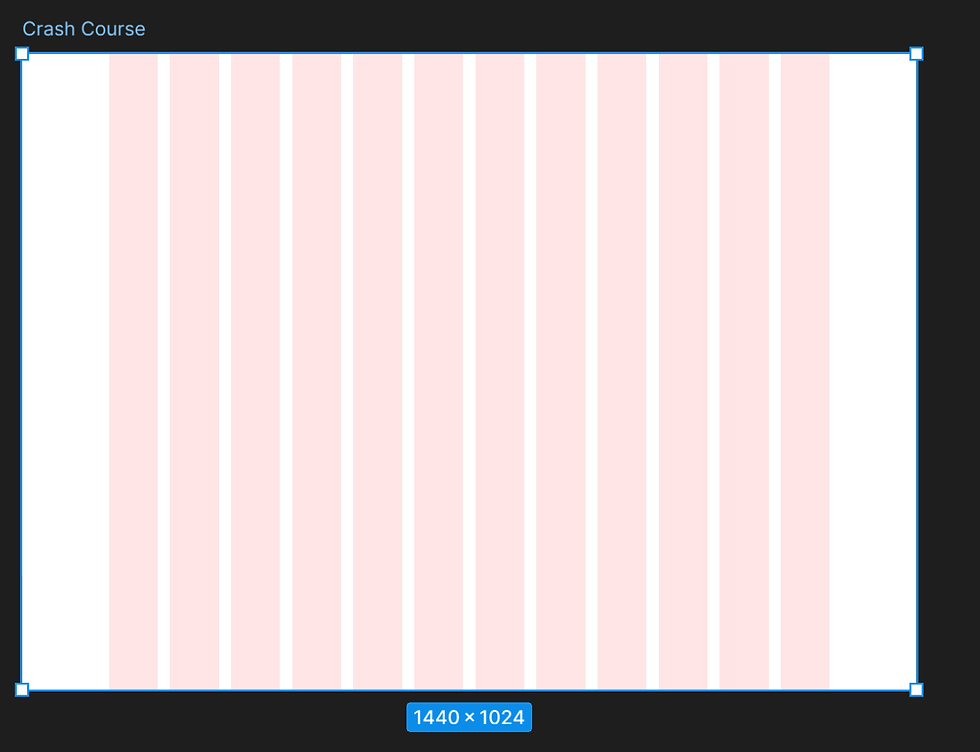
He did this in the same way I usually do it but rather than just getting on with the design and using the alt key to determine my padding from the edge of the frame, he uses the grid, so I've done the same here.
Navigation Bar
He starts with the navigation bar so I will too!
Some of the stuff here, I already knew which is great such as hanging the font size, type and casing as well as holding alt to find the spacing between elements. I also knew how to change the thickness of lines and the fact that we needed an active state as well as how to add auto layout though I never really used it.
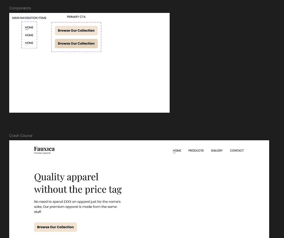
What was new is how to use a component, I knew how to make them and how to make variants too but I didn't know that they should be on another page or in another frame, stored away to be used later!
Now we prototype this component- I knew how to prototype a full screen as you can see in the previous Day 1 design of my 100 days of UI but I didn't know that you could prototype components within their variants and then bring those into the design! Ignore the typo in the logo, this was provided by the course.
Now, the navigation bar is a component so can be put on different sized frames and rescaled easily as well as any changes being reflected across the whole design! The hover states animate into one another and it looks clean without me having to go into premiere or anything to animate the prototype!
Hero Space
The first thing he talks about here is visual hierarchy which is something I've struggled with a bit in my designs before. I know what it is and that the most important elements need to be what your eye goes to first as a user whether that be through scale, colour or another way but I've had this slightly off in the past so hopefully this will help!
The first thing we've done here is add a heading and subheading keeping the visual hierarchy in mind. There are some things I personally don't like about this such as the copy for the subheading and the fact that 'stuff' is on its own line. I feel like these make it look a little 'off' and it was definitely something to be avoided when I worked at Reality Plus.
Now I have a heading, sub-heading and a CTA button that gets darker on hover!
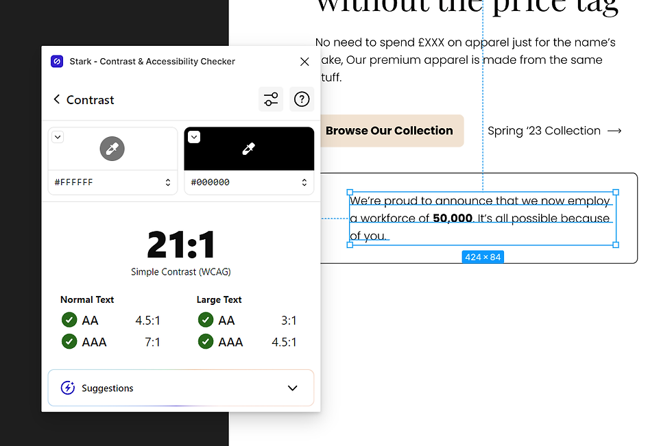
He also showed me how to use the Stark plugin which detects contrast and readability!
I checked my Honeycomb Haven design with this tool and it failed so there wasn't enough contrast in it for it to be accessible!
I then used the Confetti Genie plugin to add confetti to my design!
And finally, I used the Unsplash Plugin to find stock images for free to use in my prototype and I created some cards for my featured products.
Final Design
And here is the final prototype of my design:
And in image form:

Conclusion
Although I knew how to do a lot of the things in this course individually, I'd never had the opportunity to use it all together! This was a great way to teach myself the importance of using components and variants within my designs and prototypes! I also learnt more about how powerful micro interactions can be and how they can help to elevate signposting and interactions for the user as well as learning a little bit more about the visual hierarchy of a page without being given strict sizing guidelines to stick to as I was in my last company. All in all, this was well worth the time I've spent on it and it will definitely help me with my future designs!


Comments